Analytics
Monitor job runs, runtime trends, and failure patterns across your CI activity.
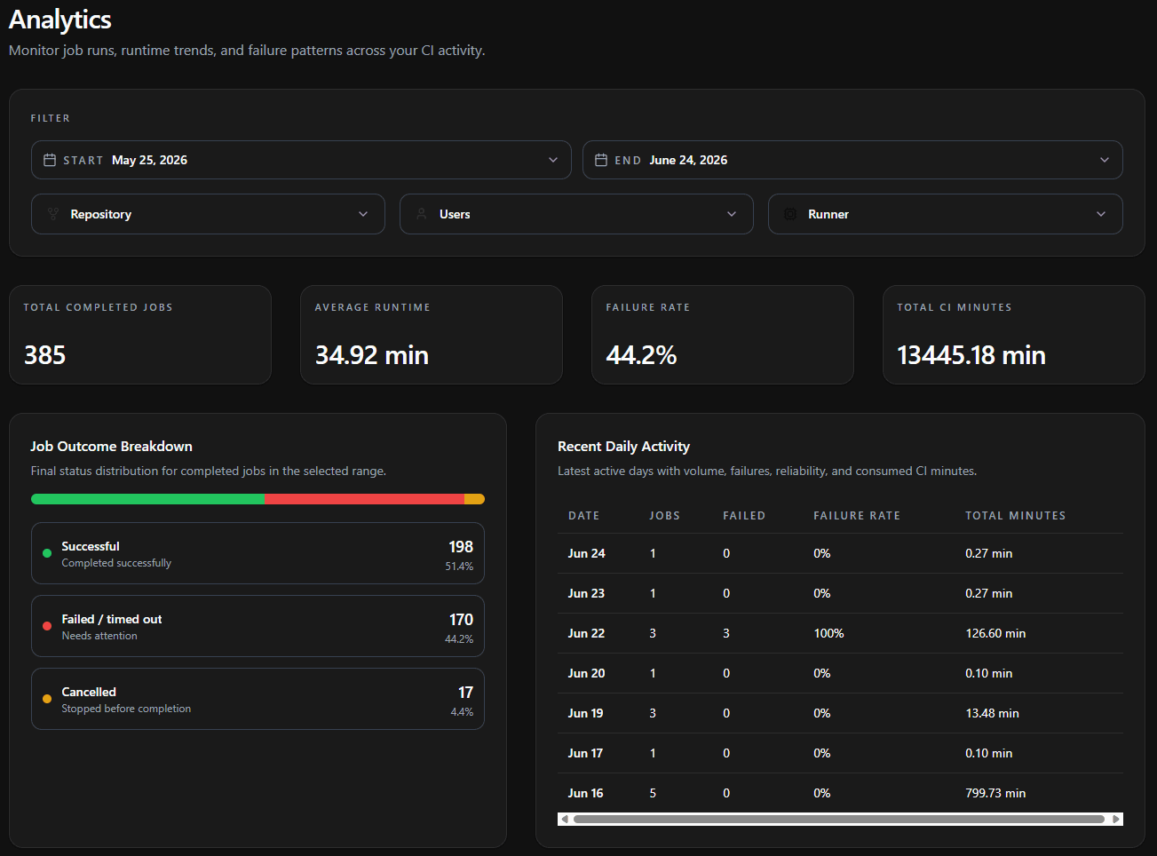
The Analytics page gives you a view of your CI job performance over a chosen date range. Use it to monitor job throughput, diagnose failure patterns, track runtime trends, and understand how many CI minutes you're consuming.
Filters
The Filter panel at the top scopes every metric and chart on the page. Filters are additive - applying more than one narrows results to jobs that satisfy all of them.
| Filter | Description |
|---|---|
| Start / End | The date range to analyze. All metrics and charts reflect jobs that ran within this window. |
| Repository | Scope to one or more repositories in your organization. |
| Users | Scope to jobs triggered by specific team members. |
| Runner | Scope to specific runner configurations to compare performance across machine sizes. |
All summary metrics, the outcome breakdown, the daily activity table, and every trend chart respect the active filters and the selected date range simultaneously. Changing any of them re-renders the page.
Summary Metrics
Four cards at the top summarize the filtered dataset for the selected range.
| Metric | Description |
|---|---|
| Total Completed Jobs | Count of all completed job executions matching the filters and date range. |
| Average Runtime | Mean wall-clock duration across all matching jobs, from start to completion. |
| Failure Rate | The share of completed jobs that ended in a non-success state, as a percentage. |
| Total CI Minutes | The cumulative compute minutes consumed by all matching jobs in the range. |
Job Outcome Breakdown
The Job Outcome Breakdown shows the final-status distribution for all completed jobs in the selected range. A stacked bar visualizes the proportions, and each outcome is listed with its job count and percentage.
| Outcome | Meaning |
|---|---|
| Successful | Jobs that completed successfully. |
| Failed / timed out | Jobs that errored or exceeded their time limit. These need attention. |
| Cancelled | Jobs that were stopped before completion. |
A high Failed / timed out share is the fastest signal that something needs attention. Apply the Repository filter to isolate which project is driving failures.
Recent Daily Activity
The Recent Daily Activity table lists the most recent active days in the range, summarizing volume, reliability, and consumed minutes per day.
| Column | Description |
|---|---|
| Date | The activity day. |
| Jobs | Number of jobs that ran that day. |
| Failed | Number of those jobs that failed. |
| Failure Rate | Failed jobs as a percentage of that day's total. |
| Total Minutes | CI minutes consumed that day. |
Use this table to spot a single bad day - for example a date with a 100% failure rate - and correlate it with the trend charts below.
Trend Charts
Three line charts plot trends across the selected date range on a shared time axis, making it easy to correlate volume, reliability, and cost over time.
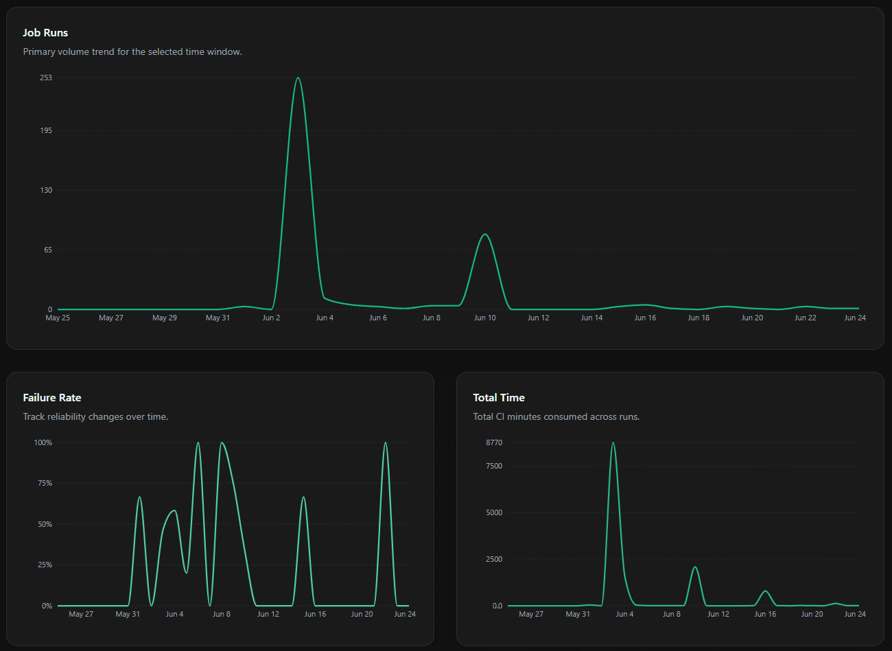
Job Runs
The primary volume trend - the number of job executions over the selected window. Spikes correspond to release cycles, merge queues, or scheduled batch workflows.
Failure Rate
The percentage of jobs that failed over time. Cross-reference with Job Runs to distinguish genuine instability from noise caused by low job volume.
Total Time
The total CI minutes consumed across runs over time. A sustained rise here without a matching rise in Job Runs means individual jobs are getting slower or routing to larger runners.
Common Use Cases
Investigating a spike in failures
Widen the date range, then watch the Failure Rate chart and Recent Daily Activity table to find the exact day failures climbed. Apply the Repository filter to narrow down which repository is responsible, then the Users filter to see whether a specific author is associated with the regression.
Comparing runner performance
Apply the Runner filter and select a single configuration (e.g. monkci-ubuntu-24.04-4). Note the Average Runtime and Total CI Minutes, then switch to another configuration (e.g. monkci-ubuntu-24.04-8) and compare.
Tracking CI cost over a release cycle
Set a date range spanning the cycle and apply the Repository filter for your release repo. Read Total CI Minutes alongside the Total Time chart to see whether your CI consumption scaled with activity.
Pricing
No Additional Cost
Analytics is included in all Monk CI plans at no extra charge. For details on overall platform pricing, visit the Pricing page.